The Nuts & Bolts Of A Highly Successful Call-to-Action
- Sheryl Jones
- August 5, 2016
- 6 Minute Read

Everyone wants an edge when visitors come to their site. The best way to engage your website visitors is still the same…give them a great user experience so that they will become a part of your business. Even the smallest of element counts in your online marketing initiatives.
Let us put it straight.
Are your visitors responding to the call-to-action on your website or landing page?
The problem with a majority of online marketing campaigns is that they are not able to understand the importance of calls-to-action and their role in the success of a lead-gen campaign. If your aim is to convert the visit into an active life-cycle journey, you need to give the visitors a strong reason to engage. In order to slide these visitors into your conversion funnel, you need to propel them with an attractive, thought-provoking, and a valuable offer through a call-to-action.
Some Hard Facts On Calls-To-Action
- More than 90% of the visitors who read the headline will also read the CTA copy.
- Clicks were increased by 371% and sales by 1617% when emails were sent with a single call-to-action.
- Adding CTA to the Facebook page will increase the click-through-rate by 285%.
- A CTA within a video gets 380% more clicks than normal sidebar CTAs.
(Source: www.protocol80.com)
The Best Practices For A Killer Call-to-Action
The essential elements of a CTA given here are something that you simply couldn’t escape as they enhance conversions. Only if you have all these elements in line, you will have created the best CTA for your online marketing campaigns.
Keep the goals in mind
Always be determined about what would you like the readers to do. You may want the reader to subscribe, download, contact, or purchase. Ensure that you have appropriate calls-to-that doesn’t lose focus from the goal and are placed at prominent places around the page. Don’t give a chance to your visitors to think. This might get them away from your page and your goals.
Select Between Buttons & Links
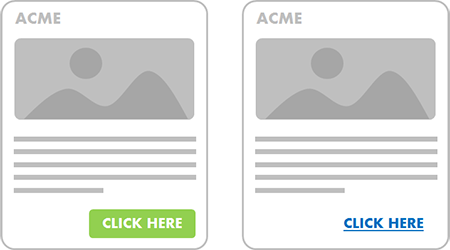
This is an ancient question. Well, the answer is simple. It depends. If you want to immediately grab attention, button is the best option. A link is a good secondary CTA option. There could be a mix of both. However, the most preferred CTA is the button.
Size
When it comes to lead generation campaigns, size of the call-to-action does matter. Size could be a dominant factor among the things that influence your conversion rate. It could rightly be said that the size of the CTA does play a huge role in the number of visitors who are converting.
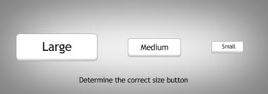
Imagine, that you have a microscopic CTA and the visitors are barely able to see it, how exactly could you expect them to locate it and click on it? When designing the CTA, you will have to keep in mind the size so that it could be easily located and at the same time the user experience isn’t disturbed. While analyzing the rest of the landing page, you will need to figure out if the CTA is able to stand out and whether it will be able to get more conversions.
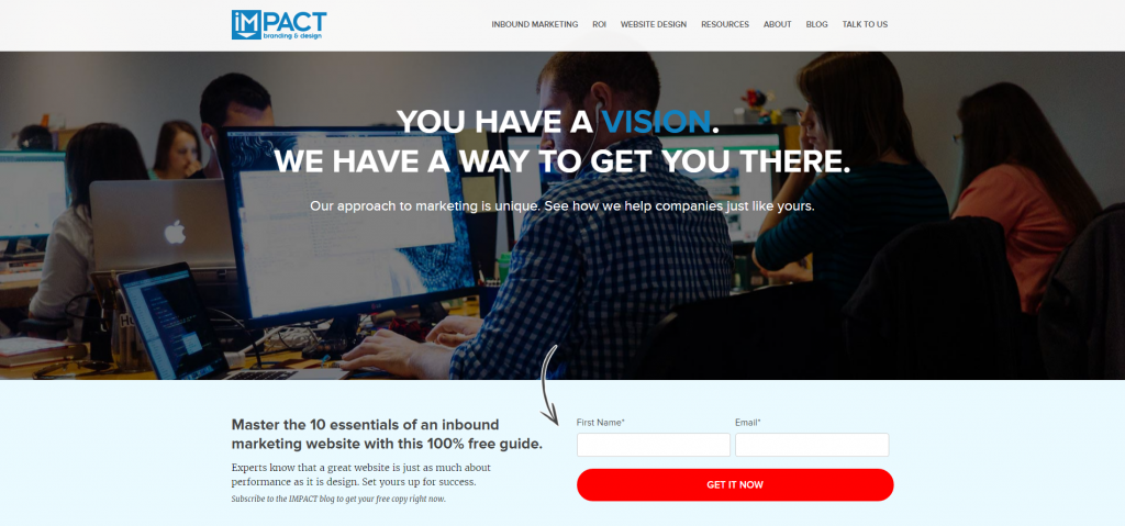
In the above example Impact Brand & Design has done a great job by directing the attention of the visitors to the form. The section efficiently describes the value and has a large call-to-action to create a sense of urgency.
Color
Color plays a huge role in influencing the decision of people. Every color is capable of evoking various emotional responses in the customers. Which color you should be using? Well, it depends on your target demographic. Every segment has a unique color choice. Pink works great with women, but it won’t necessarily work with all men. The best practice is to determine the audience preference and later choose the color of the CTA.
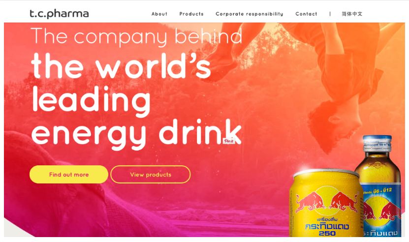
T.C Pharma’s banner has got the right combination of red, yellow, and orange colors as they indicate electrifying energy, a theme that goes well with their energy drink. The colors appeal the most to the youth for whom most of the energy drinks are targeted.
Effective CTA Copy
n lines of the size and color, the message that you insert in the CTA has tremendous influence on your conversions. This is because your CTA message should resonate with the targeted audience and only then they would click on it. Your message will be a promise to your prospects and you should ensure that it creates an impact to an extent that you start getting maximum clicks. Jargons on your buttons will spoil thinks. The language should be simple and actionable with a sense of urgency.
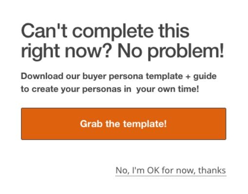
With the above example, it is quite evident that a small message is enough to propel your visitors to download the template. It effectively creates a sense of urgency and the orange color successfully grabs the attention of the viewer.
Positioning The CTA
This is perhaps the most important part of all your CTA guidance as marketers spend a lot of time in determining the best place where the CTA will get the maximum response. Should it be above the fold or below the fold? It depends on your goals.
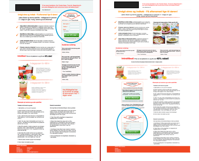
If you have a very valuable content that could spark interest and could prove to be helpful to the visitors, you better hold yourself from keeping the CTA at the very beginning. You probably could keep it mid-way or delay its appearance so that the visitor would completely consume the content before going to the next step. Alternatively, if you want to at once draw the attention of the visitor towards your CTA, which is a good signal for your conversion rate, you could go ahead and keep it above the fold.
A/B Testing
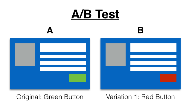
If you are a marketer, you will love A/B testing. There are several advantages of performing an A/B test including increase in the conversion rates. If you aren’t sure about the color, size, or CTA copy that will bring the best response, the best way is to A/B test the variations to find out which one is able to get the best response from your audience. There are various elements that you could A/B test, including:
- Unique value proposition
- Colors
- Size
- Image
- Content surrounding the CTA
Is there a tool that simplifies CTA creation?
If lead generation is the machine to keep businesses running, CTA is an essential oil for this machine. In order to ensure that the lead generation process is enhanced and brings out the best results, HubSpot’s CTA tool is the best vehicle that helps in building smart CTAs that could be built with all the above mentioned practices. In addition to building effective CTAs, HubSpot also offers a host of functions, including:
- It helps in monitoring and measuring the performance of each CTA.
- Convenient A/B testing tool that helps you test everything from the CTA copy to the color of the button.
- Smart CTAs could be utilized to provide tailored CTAs to the visitors based on their lifecycle journey.
At Uplers, we strongly recommend the usage of the intuitive CTA tool from HubSpot. It is way ahead from its counterparts and the Smart CTA feature is a delight for those who know the inbound marketing methodology from its foundation.
Conclusion
Although a small element, the call-to-action has the ability to make or break an online marketing campaign. It is something that will evoke the emotions of your prospects and help you achieve your business goals. The psychology of your targeted market plays a vital role in the development of your call-to-action. Ensure that you incorporate the principles of behavioural marketing into your CTA to get the maximum response from your prospects.

Thank you for submitting the details!
We will keep your information safe. Feel free to contact us with any questions at hello@uplers.com
Please check your email for next steps shared by Robert.


