Split Screen Design, Go with Motion to Bring Emotions on the Web
- Kevin Oskow
- August 23, 2017
- 5 Minute Read

The art of showcasing more in the lesser space
The split screen web components split into two or more equal vertical columns to showcase two or more messages at once. You can create an interactive layout with a text message and a video background in two different parts.
It helps you in creating a stunning website with eye-catching design patterns. showcase your concepts creatively in an interactive style with cool split screen aesthetic.
Split screen design is a modern designing pattern where you can showcase message in the one screen and the action point for users in the other. Basically, it divides the screen front user interface into two equally divided parts and triggers user action by bringing focus with minimalistic design.
You can showcase two or more messages in the single screen- introductory message in the first vertical half of the screen and the demonstration in the other half with the help of separate contained elements such as texts, photos, illustrations, and video, etc.
And that’s incredibly cool!
The unconventional format draws the user attention to a specific part and hence it is effective in driving user actions. It makes you play with the number of design patterns on a single screen.
How split screen design impact the following three things
1. Layout: Show more in lesser space
Split screen layout provides you the capability to enhance the equal importance to both elements and allow user to choose quickly. Split screen design is most impactful when comparing two or more products at a single screen.
The split screen layout is effective in showcasing your storytelling concept where you tell your story in the half section and let user drive actions in the other.
Also, this is useful in showcasing the portfolios where you can position your brand identity in the one section and demonstrate all your work in the other one.
Split screen design provides more emphasis on navigation and conserves screen space effectively. Ultimately, it improves appearance of first screen and provides more flexibility to the overall design.
However, split screen design pattern will leave you with distinctly different elements and it becomes a challenge to connect the two different containers. Use color pattern to connect these two together with the contrast and pair it with vibrant colors and dramatic typography.
Split screen layout without proper execution can hurt the user experience, whereas they are helpful in guiding and engaging users visually. It is good to promote specific content by contrasting colors and by visually emphasizing the screen parts.
Vibrant colors, contrast usage, clear typography, white space usage, subtle transition, and interactive elements or animation are the key elements of split screen designing which you can use to bring motion on the screen.
Make sure you keep the screen simple while implementing complicated interactive elements.
2. Usage: Divide user’s priority into different splits
Split screen design provides a more streamlined layout and user experience by removing the all unnecessary clutter. You can draw user attention to the call to action(CTA) button by creating visual focal point in the divided screen parts.
The biggest advantage of split screen design is that you can create visual impact on the one side and present interactive elements on the other. Split screen design makes it easy to work in animation and effects to encourage clicks, that’s how you can draw visitor’s attention and create engagement at the same time on a single screen.
Isn’t it amazing!
Split screen design works great with responsive designs and it needs to keep simple for getting good experience on the mobile screen.
To support split screen usage on mobile devices or smaller screen devices, it is advisable that viewable content should be scaled to a proper size and density.
When you’re clear with your goals and want to direct user towards some specific points then using split screen design is recommended to get desired results.
However, showcasing your products in a comprehensive style using split screen layout is effective by providing clarity in a single screen.
It is also useful in creating visual flow between screens, which help users navigating easily through the different sections on the website.
3. Behavior: Bringing emotions through motion design
Donald Norman stated that users perceive objects that are aesthetically more pleasing as being more effective. Thus, by bringing emotional approach to trigger more user engagement through smart and interactive animation makes sense.
However, motion designing bring focus to the right point at the right time. People feel more connected to a website which they can relate emotionally. They will return and make purchases repeatedly.
Emotional connections are important elements of brand recognition and longtime association as people won’t forget how you made them feel.
Depending upon your product or service type you can include emotional appeal such as heart-rending, cute, happy, funny, organic, bright, dreamy, warm, etc. on your website to evoke emotions among your site visitors.Material designenable you smartly to trigger spatial relationships, functionality and intention in a beautiful style on the web.
Create awesome transition with the help of animation and connect your users and put them into action on your smart and split screen. And the users will get overwhelmed by the quick and action oriented response to their intent.
How to create an effective landing page with split screen design
Split screen is most effective in creating landing pages with targeted focus and gives better user experience (UX). It is very useful in creating effective landing webpages for two side by side selectable products or options.
Easily create and show login and signup forms effectively using split layout. It is impressively incredible in creating paid and free subscriptions landing pages.
Never hesitate to opt split layout for demonstrating products that come in alternate colors.
Small animation and visual effects when blended together with the other elements of the design frame helps in smooth transition. It scrutinizes every element in an individual frame and then alter those elements within the frame to achieve perfect performances at the perfect time.
So, consider motion designing an important element while designing a new landing page for your marketing purpose to trigger users action.
Best examples of split screen designing
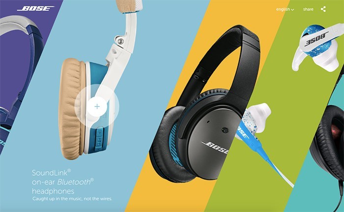
Bose: Bose has demonstrated its exciting range of headphones in an impeccable style using split screen layout.
Benchmark International
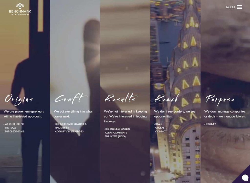
The website has beautifully demonstrated the entire menu with the help of split screen design into 5 vertical splits. Isn’t impressive?
Split screen designs are functional and responsive way to create greater engagement on the web and this is fun. You need to take care of mobile friendliness while creating a website with split screen design layout as they are not much mobile friendly. Also, do not split your screen unnecessarily and make proper use of negative space.
Motion graphics when implemented smartly on split screen layout creates a productive environment on the web. Let’s connect with experts to transform your beautifully crafted designs into awesome functional websites.
However, we would like to know your experience and suggestions for implementing split screen design in the web development practices.