How to Use Responsive Web Design to Boost Conversions
- Bhuvan Desai
- June 7, 2017
- 4 Minute Read

Today, we are surrounded by different kinds of devices that differ from the software used to the screen size it has and in such a case it is not possible to design the website separately for each and every device.
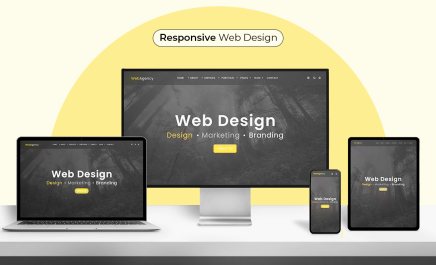
Here’s where responsive design comes to the rescue. A website built with responsive web design will adapt itself to various devices. That in turn will help the visitors visit your website anytime and anywhere.
For the website to be responsive, design and development must be kept in symphony and the website must be built in a way that it responds to user’s behavior and environment depending on screen size, platform and placement.
That’s easier said than done and thus we have mentioned some surefire tips that will help you create a responsive web design easily.
1. Use a mobile first approach
With the world quickly turning to everything that is a touch away from a click away, it is mandatory to keep a mobile first approach for your web design. Mobile and Tablet devices accounted for 51.3% of internet usage worldwide in October compared to 48.7% by Desktop and Mobile Commerce will make up for 45% of Total eCommerce.
2. Touch Enabled Design
A touch enabled design is in sync with the mobile first approach and it makes navigation through mobile easy for the visitors. A touch enabled design means designing of buttons in a way that they can be clicked on smaller screens, usage of tiny animation around arrows that point toward any sort of navigation on the page.
3. Use a Design Prototyping Software
A design prototyping software is mainly used to ease out the to and fro process between the client and the designer and test the responsiveness and interactivity of the web design. This will provide various features like real time presentation, tracks of changes done & people who viewed the design, ability to use a hotspot to give feedback on a particular section in the design.
4. Use a readymade framework – Bootstrap
Bootstrap is a readymade framework that provides a lot of easy components that are mandatory for effective and efficient websites. It works great on the devices like a desktop, a tablet and a mobile phone. Bootstrap provides codes in abundance & that saves you from the time and effort used in setting up grid, content layout, establishing breakpoints and so on.
5. Google’s resizer
The Google’s Resizer tool will give you a clearer picture of how your website would respond to various breakpoints across various devices. This is a must-have tool because knowing all the breakpoints will provide the freedom to change the web design accordingly and in a way that it stays fit for desktop, tablet and mobile.
6. Responsive Typography
Responsive Typography is the mandatory add on for a responsive web design. For a responsive typography, you must check the line spacing in different devices and choose the fonts that go with the tone of the website. The font size and format must be such that they don’t look cluttered and stitched by the tails when viewed in devices with smaller screens.
7. Media Queries
Media Queries is a CSS3 module that allows content to adapt to conditions like screen resolution. This has turned into a W3C recommended standard from June 2012. Media Queries lets you decide the width of the design layout in different devices. It would be best to decide three media queries for a web design – mobile, tablet and desktop.
8. Fluid Grids
A maximum layout size is decided, based on percentage, for fluid grids and then the layout is split into various columns where each element is designed with proportional width and height. Whenever the screen size changes, the layout adapts itself to the widths and heights specified by the screen size. Additionally, Fluid Grids doesn’t require many adjustments.
9. Navigation
Creativity is undoubtedly important when it comes to designing a beautiful website. But is shouldn’t come at the cost of a messed up navigation menu that confuses users because after reaching a company’s website via a referral link, 50% of the visitors will use the navigation menu to orient themselves. Navigation must be easy with everything the user wants being in a 3 click radius.
10. Look and feel of your website
38% of people will stop engaging with a website if the content/layout is unattractive. The look and feel of the website i.e. everything from the images to the typography must go with the tone of your website with flickers of creativity every now and then. Users will quit a website if it makes them the feeling of a corporate industry.
11. Content Overloading
Content overloading can kill the look of the website. When you write up content for the website, make sure that the content is structured in a way that only the mandatory information about anything and everything that would be useful to the user is present in a non-cluttered way under the required headlines so that users don’t get the feeling of being on a wild goose chase.
12. Image Quality vs. Download Speed
39% of people will stop engaging with a website if images won’t load or take too long to load. But then what’s the point of a poor-quality image that loads fast? Integrating Google AMP will give your website a boost up the SERP as well as maintain the image quality while the page loads fast. Google AMP is now recommended by Facebook as well.
13. Flexbox
Flexbox is useful when it comes to material design because it will assemble the elements of the website on its own when that website is opened in devices with different screen sizes. Flexbox sizes will either decrease and use up the extra space or will increase and make space for the elements to be shown within the constrained space.
14. Arising Framework – Material Design
Material Design framework, is adopted by many brands like Jet Radar, WhatsApp etc. because of the subtle relationship that it builds between the real world and the website elements. Material Design adds a feeling of reality and humanness to the website, which is mandatory because out of all the reasons for rejecting or mistrusting a website, 94% were design related.
Thus, building a responsive website is the most sensible and time saving idea to not only build a beautiful website but also gain conversions by using the tips mentioned above.
The tips mentioned above are those we know to be the best for the best implementation of responsive web designing and if you have got any amazing tips, then we would love to hear about them in the comments.
Similar Articles


Thank you for submitting the details!
We will keep your information safe. Feel free to contact us with any questions at hello@uplers.com
Please check your email for next steps shared by Robert.
